Shopify Collection Banners: Add, Change, Fix, Remove
Learn how to add a unique banner to each Shopify collection, stop cropping, hide or remove banners, and link them, plus how banners fit with search merchandising.

Shopify Collection Banners: Add, Change, Fix, Remove
A Shopify collection banner is the image and heading at the top of a collection page. Most themes pull it from the image you upload to the collection. To give each collection its own banner without touching the others, create a collection metafield of type File (image) and connect it as a dynamic source in the theme editor’s banner section. The rest of this guide covers that setup, why banners get cropped, how to hide or remove them, and how to make a banner link to a collection.
TL;DR
- By default, the banner uses the image uploaded to the collection in Shopify admin. A metafield lets each collection carry its own banner.
- Dynamic sources change one collection’s banner and leave the default template alone for every other collection.
- Cropping is usually a ratio problem: Shopify reuses one image for desktop and mobile, so keep the subject in the center and adjust the focal point.
- Hiding or removing a banner is theme-specific. Check the theme’s settings first, then a section or snippet, and use CSS only for text.
- A banner brings shoppers to the page. Search and merchandising decide whether they find a product once they are there.
Table of Contents
- What a Shopify collection banner is and where it appears
- How to add a different banner to each collection
- Changing one banner without affecting the rest
- How banner settings differ by theme
- Why your banner is cropped, and how to fix it
- How to hide or remove a banner on a collection page
- Banners on collection list pages, and banners that link
- Keeping banners fast and readable
- What banners cannot do: the search side of a collection
- Our perspective
- Want search to match your banners?
- FAQ
- Sources
What a Shopify collection banner is and where it appears
A collection banner is a key visual and informational component on the collection page. It usually carries the collection image, the title, sometimes a description, and often breadcrumbs that help shoppers navigate back up the catalog. It sits above the product grid, so it is the first thing a visitor sees after clicking a category in your menu or an ad.
In the theme editor, collection pages start with a Collection banner section followed by a Product grid section. That order matters when you troubleshoot. Anything about the hero area, such as height, text position or image, lives in the first section. Anything about products, filters or pagination lives in the second.
The banner does three jobs:
- It confirms the shopper landed in the right place.
- It frames the range with a visual, a short line of copy or a seasonal message.
- It pushes the product grid down the page, which is the trade-off to design around.
Because of that third point, a tall banner is not automatically better. On mobile, a large hero can hide every product below the fold. Keep it purposeful.
How to add a different banner to each collection
By default, the banner uses the image uploaded in the collection settings. That works if you are happy with one image per collection and the image already has the right shape. The catch is that collection images are often square or portrait, and a banner is wide. A typical image ratio of 3:4 is not suitable for a horizontal banner, which is why many merchants want a separate banner image.
The standard answer is a metafield. Create a collection metafield of type File (image) and connect it as a dynamic source in the theme editor’s banner section. The steps look like this:
- In Shopify admin, open Settings, then Custom data, then Collections, and add a definition. Name it something clear such as Banner image and choose the File type, limited to images.
- Open a collection in Products, then Collections. Scroll to the metafields area and upload the banner for that collection.
- Open the theme editor and go to a collection template. Select the Collection banner section.
- Click the dynamic source icon next to the image setting and choose your new metafield.
- Save, then check a collection that has a banner and one that does not.
This lets each collection have its own unique banner image, which you update in the collection editor, so the merchandising team never has to open the theme again after setup.
Some themes document a priority order. One theme’s help center lists collection metafield banners first, then fixed section images, then the collection image. Even if your theme does not document it, test a collection with no metafield to see what the fallback looks like. A good fallback is the normal collection image, so a forgotten upload never leaves a blank hero.
A naming habit that saves time
Name banner files the way you name collections: womens-denim-banner-desktop.jpg, not IMG_4471.jpg. When you have 60 collections and a seasonal refresh, you will be glad you can find the right file in the Files library.
Changing one banner without affecting the rest
The common complaint in the Shopify community is a merchant who edits the banner in the theme editor and watches every collection change. That happens because theme settings apply to every page using the same template. Settings apply to pages using the same template unless you use multiple templates or dynamic sources.
You have two clean options:
| Approach | Best for | What it changes |
|---|---|---|
| Dynamic source (metafield) | Many collections, each with its own image | Only the collection with a value in the metafield |
| Alternate template | A few special collections with a different layout | Only collections assigned to that template |
Dynamic sources apply unique content to specific collections while the rest of the store follows the default template. Use it as your default. Reach for an alternate template only when one collection needs a genuinely different layout, for example a lookbook-style page with a taller hero and a text overlay.
When you create an alternate template, remember to assign it in each collection’s Theme template dropdown. A new template does nothing until a collection uses it.
How banner settings differ by theme
Shopify’s free and paid themes name things differently, but the controls follow a pattern. Themes commonly let you adjust banner height, text position, overlay opacity and the image focal point. Others add an Enable full bleed setting that makes the section fill the page to the outer edges, or let you show or hide the collection image and title, adjust title settings and configure breadcrumbs.
A few practical notes when you move between themes:
- Empty collection image. Some themes offer a setting to use the first product image as the collection image when none is assigned. Handy for large catalogs, but the result is a product photo stretched into a banner, so treat it as a safety net.
- Text over image. Overlay opacity is the control that keeps white titles readable on a bright photo. Adjust it before you reshoot the image.
- Breadcrumbs. They help shoppers who arrive from Google on a deep collection. Keep them on unless the design truly cannot fit them.
If you are on Dawn and the banner looks off, the cause is usually the image shape, not a bug. That brings us to cropping.
Why your banner is cropped, and how to fix it
This is the most searched problem around banners. A merchant uploads a lovely wide image and the theme shows a slice of it, on desktop, on mobile or both.

The cause is simple. Shopify does not natively support uploading separate mobile and desktop images, so the same source image is reused and cropped to whatever space is available. The banner container has its own shape, set by height and width settings, and the image is scaled to cover it.
Fixes, in the order to try them
- Set the focal point. Themes that offer it let you adjust the image focal point so the main subject stays centered and in frame as the layout adapts to different screens.
- Respect a safe zone. One guide recommends keeping key elements and text within the center 50 to 60 percent of the image so they survive mobile cropping. Put the model, product and any baked-in text inside that area.
- Change the banner height setting. A shorter container crops more from top and bottom. A taller one crops less but pushes products down.
- Switch to an image-with-text layout if the theme offers it for collection pages, so the image displays uncropped next to the title.
- Avoid text baked into the image. Text in the picture shrinks on mobile and gets cut. Use the theme’s heading and description fields instead.
When you are choosing or shooting banner photography, think about composition before you export. A subject placed off-center is the first thing to be cut. If you shoot your own imagery, these website photo tips on framing images for web use carry over to hero banners.
How to hide or remove a banner on a collection page
Removal is where theme differences bite. The visible banner may be generated by a section or snippet rather than by the collection template itself. In one community case, the collection template referenced another section file, so the banner code lived there and not in the file the merchant first opened.
Work from the least invasive method to the most:
- Theme editor first. Many themes let you toggle the collection image or title off. No code needed.
- Remove or disable the section from the collection template if your theme builds the page from sections.
- Hide only the text, keep the image. Community guidance separates hiding the text wrapper from removing the image. For the default Collection banner section, the suggested Custom CSS is
.collection-hero--with-image .collection-hero__text-wrapper { display: none; }. - Theme-specific edits. For one theme, the guidance is to add a CSS rule at the bottom of base.css targeting
.collection-hero__text-wrapper. For another, it is to edit the collection-banner file, findcollection.titleand addstyle="display:none;"to the element containing it.
Those snippets come from community threads for specific themes and versions. Class names change between releases, so duplicate your theme before editing code, test on a draft, and prefer the editor setting when one exists.
A thought before you remove the banner entirely: hiding it makes the page shorter and puts products higher, which can help. But a collection page with no heading and no description gives search engines and shoppers less to work with. Often the better move is a smaller banner with a short description rather than none.
Banners on collection list pages, and banners that link
Two related jobs come up often.
A banner on the collection list page. The page that lists all collections is built differently from a single collection page. One page-builder guide describes creating a collection-list page, adding hero banner elements, replacing their images and pasting each collection’s URL into the banner’s link setting. If you want to stay in the theme editor, use an image banner or featured collection section on a custom page template and link each block to its collection.
Making a banner clickable. Homepage banners that point to a collection are the classic case. In most themes, the image banner section has a Link field per block or per section. Paste the collection URL, which looks like /collections/your-handle, and test it on mobile, where a tap target that is too small gets missed. If your theme’s banner has no link field, it is worth checking whether a different section, such as a slideshow or image-with-text, includes one.
Write alt text that says where the banner goes, for example “Shop women’s denim”, so the link is understandable to screen reader users.
Keeping banners fast and readable
A banner is usually the largest image on the page, so it affects load time. Export at the size the layout actually needs, use a modern compressed format and avoid uploading a camera original. Shopify serves resized versions, but starting with a sensible file helps. If you want to go deeper on speed, this roundup of caching plugins for Shopify is a place to start.
For readability, check contrast between the title and the image on both a bright and a dark day-of-launch photo, raise the overlay opacity if needed, and keep the heading as real text rather than part of the picture.
What banners cannot do: the search side of a collection
A good banner tells shoppers they are in the right place. It does not help the shopper who types “black wide leg jeans” into the search bar, mistypes it, and sees nothing. Collection pages and search results are two doors into the same catalog, and merchants often polish one and neglect the other.
If you are already thinking about how pages look, it is worth looking at how shoppers find things. We wrote about pulling your top 50 queries before adding search banners, which applies the same banner thinking to the search results page. For the product-ordering side of collections, our guide to the merchandising grid editor shows how to pin products and let rules handle the rest, and the 30-minute visual merchandising audit gives you a repeatable routine. If you want a quick read on your own store, the free Shopify search test is a fast place to begin.
Our perspective
We see collection banners as the first half of a merchandising conversation. The banner makes a promise: this is the denim, the gifts, the new arrivals. The product grid and the search box have to keep it.
In our work, that is where stores leak sales. A shopper clicks a beautiful hero, scrolls, doesn’t see the right product in the first rows, and searches instead. If search then stumbles on a typo or a natural phrase, the visit ends. Our service is designed to close that gap: typo-tolerant and semantic search, synonym mapping, and a visual merchandising grid editor for both search and category pages, managed for you and tuned on your store’s real data.
So our advice is to treat banners, grids and search as one system. Set banners with metafields so the team can change them without a developer, decide which products lead each collection, and review what shoppers actually type. Our Shopify search merchandising guide walks through that routine.
Barikreativa
Want search to match your banners?
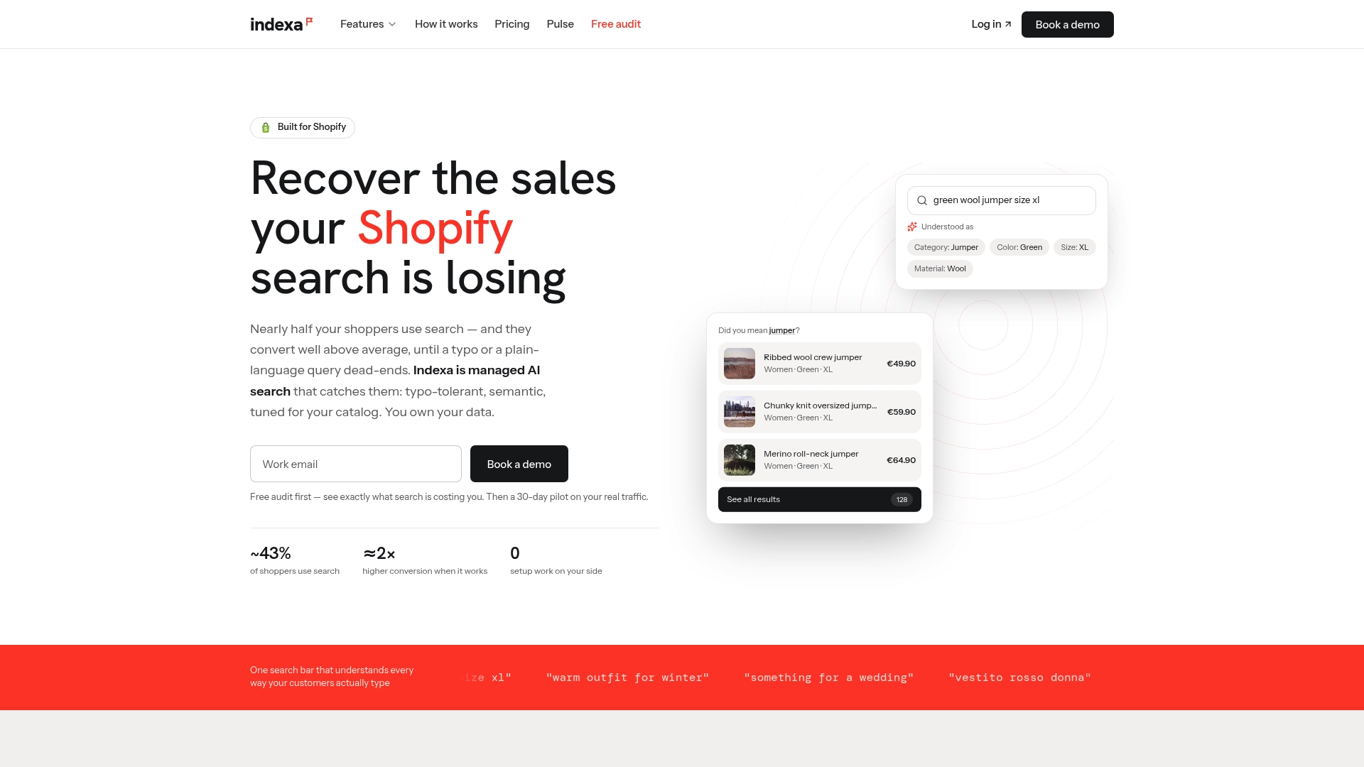
If your collection pages look the way you want but shoppers still bounce from search, we can help. Indexa is a fully managed search and discovery service built for Shopify, with no setup or coding required on your side. We tune relevance on your own store data, and you keep ownership of your data with month-to-month billing and no per-request fees. Start with a free audit to see where search is costing you sales, or look at how the 30-day pilot and pricing work.
If you are comparing options, here is how Indexa goes beyond Shopify Search & Discovery.
FAQ
Can I use a different banner image on every Shopify collection?
Yes. Create a collection metafield of type File (image), upload a banner to each collection, and connect the metafield as a dynamic source in your theme’s collection banner section. Collections without a value fall back to the default template, so the rest of the store is untouched.
Why does my collection banner look cropped on mobile?
Shopify reuses one image for desktop and mobile, and the theme crops it to fit the available space. Keep the subject and any text within the center 50 to 60 percent, set the image focal point if your theme has one, and adjust the banner height setting.
How do I hide a collection banner without deleting the image?
First check your theme editor for a toggle to show or hide the title or image. If none exists, community guidance for some themes uses a small CSS rule that hides only the text wrapper. Class names vary by theme, so duplicate your theme and test before publishing.
How do I make a banner link to a collection?
Open the banner or image section in the theme editor and paste the collection URL, such as /collections/your-handle, into its link field. If the section has no link field, use a section type that supports links, such as a slideshow or image-with-text block.
Sources
- Collection page, Omni Themes Support Center
- Shopify Help Center, Templates
- Banner, Stiletto by Fluorescent
- Collection Banner, The4
- How to use metafields to show different images per collection
- Add a Banner to Shopify Collection Pages: 3 Methods
- Collection banner, Switch Docs
- Collection page, Clean Canvas User Guides
- Collection image, Maestrooo
- Remove collection banner in collection page, Shopify Community
- Creating hero banners for each collection, Shopify Community
- Removing collection banner title, Shopify Community
- Remove collection title from banner but keep image, Shopify Community
- Create a Collection List Page, GemPages Help Center
- Small businesses: About page photos that convert in one hour
- Top 6 caching plugins Shopify
Recommended
Make discovery work harder.
See what your Shopify search could do better with a free, hands-on audit.
Get your free search audit