Beat Shopify's 10 Result Limit: Improve Search UX Without Rebuilding
Improve Shopify search fast. Show predictive suggestions, fix product metadata, and follow a Shopify-first checklist that maps API limits to...

Beat Shopify’s 10 Result Limit: Improve Search UX Without Rebuilding
Make predictive search visible and fix product metadata first. These two changes deliver the fastest lift in findability because shoppers judge a store’s search within seconds, and a clean type-ahead paired with well-tagged products turns that first query into a click instead of a bounce. The checklist below walks through implementation in order.
TL;DR:
- Shopify’s predictive search API limits results to 10 per resource type, requiring clear grouping under headings like Products and Pages for optimal UX.
- Filter layouts should match catalog size, with checkboxes for multi-select options and dual-handle sliders for price, and filters must be mobile-friendly and easy to access.
- Ensuring clean, consistent product metadata, such as normalized
product_typevalues and metafields, is crucial for a reliable search experience.- Native Shopify search suits smaller catalogs but may need upgrading when zero-result queries persist or search complexity increases significantly.
- Regularly monitoring zero-result rates, updating synonyms, and employing recovery tactics on no-results pages can reduce abandoned searches and boost conversions.
Table of Contents
- Predictive search UX and Shopify’s built-in constraints
- Filter controls, layout, and mobile patterns that keep shoppers moving
- Turning data and theme code into a working search experience
- When native Shopify search is enough, and when it isn’t
- Fixing zero-results pages and measuring search over time
- What most merchants get wrong about search
- Get a clear read on your store’s search before you rebuild it
- Developer docs and research behind this guide
- Sources
- FAQ
Predictive search UX and Shopify’s built-in constraints
Shopify’s Predictive Search API returns products, collections, pages, articles, and query suggestions in one call, but it caps results to a maximum of ten and searches a default field set of title, product type, variant title, and vendor, according to Shopify’s API reference. That limit matters for design: cramming ten products into a dropdown without grouping them by type overwhelms shoppers before they finish typing.
Shopify’s own UX guidance lays out how to structure that dropdown so it earns its space. The predictive search UX guidelines call for labeled resource headings so shoppers know they’re looking at Products versus Pages, highlighted matching text within suggestions, and a persistent “search for [query]” link so someone can still run a full search when the dropdown doesn’t have what they need. The query itself should usually stay visible in the input field rather than clearing on focus loss, and the dropdown needs an obvious close or clear action.
Accessibility is not optional here. The dropdown should follow the W3C ARIA listbox pattern, respond to arrow keys and Enter, and manage focus so screen reader users hear what’s happening as they type. One frequent gap: browser and mobile OS autocomplete overlays can visually collide with a custom predictive dropdown, so the input needs autocomplete="off" and testing across iOS and Android browsers.
A few rules make the difference between a helpful dropdown and a cluttered one:
- Group results under clear headings like Products, Collections, and Pages rather than mixing them.
- Cap suggestions low enough to scan in under two seconds, even though the API allows up to 10.
- Always include a link to run the full search, since predictive results are a preview, not the complete answer.
- Keep the typed query visible and editable at every step of the interaction.
Pro Tip: Fetch the predictive-search section response instead of building markup from raw JSON. It keeps your dropdown styled consistently with the rest of the theme.
Filter controls, layout, and mobile patterns that keep shoppers moving
Shopify’s storefront filtering UX guidelines recommend checkboxes for any list filter where a shopper might want more than one value at once, like size or color, since checkboxes clearly signal multi-select compared to single-select dropdowns. For price, the same guidance points to combining a dual-handle slider with labeled From/To input fields, giving shoppers both a quick visual drag and a precise number entry.
Layout should match catalog complexity rather than a house style preference. A horizontal toolbar works when a store has three or four filters, while a vertical sidebar handles a dozen filter groups without forcing shoppers to scroll through a wall of toggles just to reach the product grid. Larger catalogs sometimes benefit from offering both, with the sidebar as the primary tool and a toolbar surfacing the two or three filters shoppers use most.
Four practices keep filtering from turning into a dead end:
- Show every applied filter as a removable pill or breadcrumb near the top of the results.
- Provide a single “clear all” action, not just individual removals.
- Preserve filter state in the URL so back-button navigation and shared links still work.
- On mobile, move filters into a drawer or modal triggered by a sticky button rather than pushing them above the product grid.
Mobile shoppers also benefit from having the one or two most-used filter groups expanded by default instead of collapsed, since an extra tap to open a filter section is often the tap that gets skipped.
Pro Tip: Test your filter drawer with one hand on a phone. If reaching the apply button requires a stretch, move it to a thumb-friendly position.

Turning data and theme code into a working search experience
Search UX lives or dies on the data underneath it. Canonicalize product titles, normalize product_type values so “Tee” and “T-Shirt” don’t split the same catalog in two, and fix inconsistent SKUs and variant naming before touching any front-end code. Filterable attributes like fabric, fit, or occasion belong in metafields with a consistent, normalized vocabulary rather than in tags, since tags carry no schema and drift out of consistency as a catalog grows.
On the implementation side:
- Add a search input tied to a predictive-search theme section, then write JavaScript that fetches the
/search/suggestsection response and injects the returned markup, following the pattern in Shopify’s theme documentation. - Set the
resources[limit]parameter deliberately rather than defaulting to the maximum, and chooselimitScopebased on whether you want limits applied per resource type or across all types combined. - Configure synonyms, boosts, result type choices, and combined-listing display inside Search & Discovery, following the settings documented in Shopify’s Help Center, including how unavailable products should behave in results.
- Map metafields to your filter UI, decide on toolbar versus sidebar layout, and build the applied-filter pills with URL persistence described above.
- Stage the rollout to a subset of traffic where possible, monitor search query logs for the first two weeks, and watch session replays for hesitation around the search box or filter panel.
QA before launch needs its own pass separate from visual review:
- Tab through the entire search and filter flow using only a keyboard.
- Confirm ARIA roles and live region announcements fire correctly with a screen reader.
- Check that mobile keyboards don’t cover the input or suggestion list.
- Verify browser and OS autocomplete is disabled on the search field.
Once live, plan to revisit synonyms and boosts weekly rather than treating the initial setup as finished.
When native Shopify search is enough, and when it isn’t
Search & Discovery’s native predictive suggestions, synonyms, boosts, and partial matching cover a real share of stores well, especially smaller catalogs with straightforward taxonomy. The constraints are the same ones covered above: a 10-result ceiling on suggestions and a default field set that won’t catch every way a shopper phrases a query.
A few signals suggest it’s time to look at something more capable:
- Zero-result queries keep repeating for terms that clearly map to products you carry.
- Query abandonment is high even though the store has traffic and relevant inventory.
- The catalog has grown complex enough that synonym lists and manual boosts take real weekly effort to maintain.
- Shoppers phrase searches in natural language or make typos that partial matching doesn’t resolve well.
Before upgrading to an enterprise managed search or advanced semantic search engine, weigh the checklist honestly: how much revenue is actually tied to failed searches, what search-specific KPIs are you tracking, how much staff time goes into manual tuning each month, and whether your team has the bandwidth to keep that tuning current as the catalog changes.
Fixing zero-results pages and measuring search over time
A zero-results page is a moment where a shopper was ready to buy and got nothing back. Baymard’s research on no-results pages outlines five recovery tactics: related category links, simplified alternative queries shown with product previews, personalized recommendations, a visible contact or chat link, and a list of popular or trending products.
Track these regularly:
- Zero-result rate across all search queries.
- Query-to-click rate and search conversion rate.
- Revenue per search session.
- A running list of frequently failing queries.
Baymard’s broader product-finding research, built on more than 5,000 hours of usability testing, finds that shoppers search in varied ways, including by feature or use case, and recommends treating those feature words as filter signals rather than free text alone. That single shift reduces false zero-results significantly.
Review failing queries weekly, update synonyms and boosts monthly, and run a full UX audit of search and filters quarterly.
What most merchants get wrong about search
Merchants tend to treat search as a pure algorithm problem, tuning relevance scores while ignoring the interaction details that actually determine whether someone finds a product: input focus, keyboard handling, filter persistence, and whether the mobile filter drawer is reachable with a thumb. Those details, not the ranking formula, are usually what separates a search box that converts from one that doesn’t.
The practical case for ongoing management is continuity. Search behavior shifts as a catalog changes, and synonym lists or boosts that made sense at launch go stale within a season. Indexa approaches this as a managed service: typo-tolerant and semantic matching plus continuous tuning based on real store queries, with merchandising controls that let a team adjust results without redeploying theme code.
— Barikreativa
Get a clear read on your store’s search before you rebuild it
Some managed solutions run as layers on top of Shopify stores, offering typo-tolerant, semantic search that understands natural-language queries, often with no code changes required on the merchant’s end.
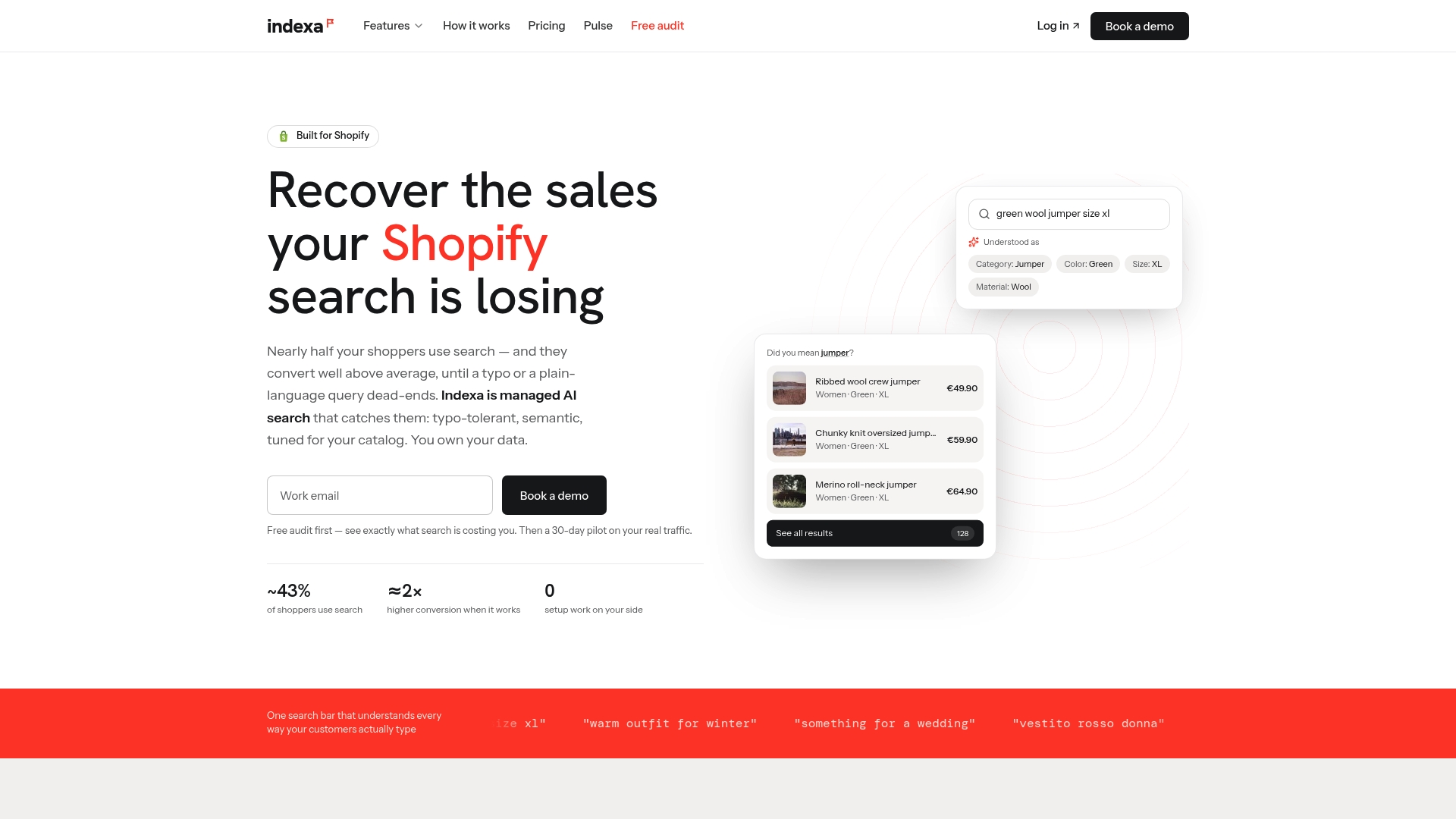
- Start with a free Shopify search audit to see where queries are failing today.
- Move to the 30-day pilot if the audit turns up recoverable revenue worth chasing.
- Expect better product discoverability and fewer abandoned searches, without a claim of specific numbers before your own data is in.
Developer docs and research behind this guide
This guide draws on Shopify’s own developer and merchant documentation alongside independent usability research rather than opinion.
- Predictive search UX guidelines and the PredictiveSearch API reference for type-ahead behavior and limits.
- Storefront filtering UX guidelines and Search & Discovery settings for filters, synonyms, and boosts.
- Baymard Institute’s product-finding query research and no-results page study.
- A third-party breakdown of Search & Discovery app use cases for merchants comparing configuration approaches.
Sources
- Predictive search UX guidelines
- PredictiveSearch (Storefront API)
- Storefront filtering UX guidelines
- Ecommerce search query types (Baymard)
- Modifying search with Shopify Search & Discovery (Shopify Help Center)
FAQ
What is the fastest way to improve Shopify search UX?
Make predictive search visible with clear resource headings and clean up product metadata, especially product_type values and filterable attributes stored in metafields. These two changes address the most common causes of poor findability without a full platform change.
How many results can Shopify’s predictive search show?
Shopify’s Predictive Search API allows a configurable limit between 1 and 10 results per resource type, with title, product type, variant title, and vendor searched by default. Store owners choose the limit and scope when implementing the predictive-search theme section.
Should I use a sidebar or toolbar for filters?
Shopify’s filtering UX guidance recommends a horizontal toolbar for a handful of filters and a vertical sidebar when a catalog has many filter groups. Larger stores often combine both, using the sidebar as the primary filter panel and the toolbar for the most-used filters.
When should I consider a managed search solution instead of native Shopify search?
Consider it when zero-result queries keep repeating for products you actually carry, when query abandonment stays high despite good traffic, or when your team spends real time each week manually tuning synonyms and boosts. Services like Indexa’s managed AI search handle typo tolerance and semantic matching with ongoing tuning built in.
What should a no-results page include?
Baymard’s no-results research recommends related category links, simplified alternative queries shown with product previews, personalized recommendations, a contact or chat link, and a list of popular or trending products. Combining several of these reduces shopper abandonment on a page that would otherwise be a dead end.
Recommended
Make discovery work harder.
See what your Shopify search could do better with a free, hands-on audit.
Get your free search audit